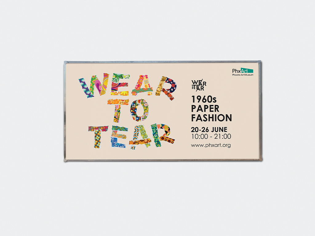
Wear to Tear
Brand Identity Design
Project Details
- Category: Typography Design
- Softwares: Adobe Illustrator & Photoshop
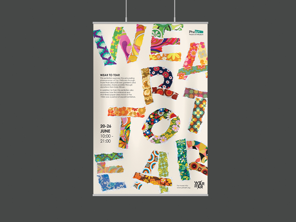
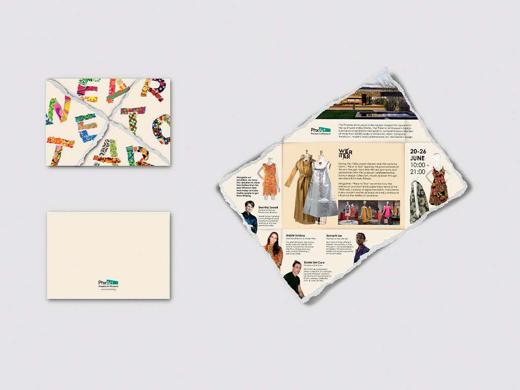
For this conceptual project, I reimagined the identity of an existing exhibition by the Phoenix Art Museum. Drawing inspiration from the playful and experimental spirit of 1960s paper fashion, the design explores how this whimsical trend shaped modern textiles. The key visual is built around the title “WEAR TO TEAR,” with each letter featuring different textile paper designs and torn edges, symbolising the temporary and bold nature of paper garments from the era.
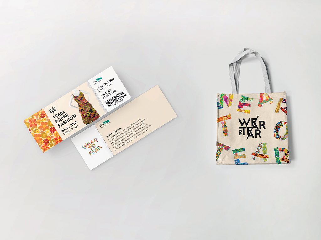
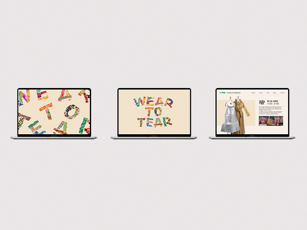
The design spans various touchpoints, posters, leaflets, event tickets, a website, banners, and tote bags, each crafted to reflect the fun, quirky tone of the exhibition. Through these visual elements, the identity aims to engage a young, vintage fashion-loving audience, encouraging them to reflect on how past trends continue to influence creative practices today.

